
Why settle for data debris when you can see your entire landscape?
Most companies drown in numbers but starve for clarity. Qatar Metric Structure transforms raw output into an architectural dashboard. We don't just list metrics; we build a narrative of technical reporting efficiency tailored for the Doha business ecosystem.
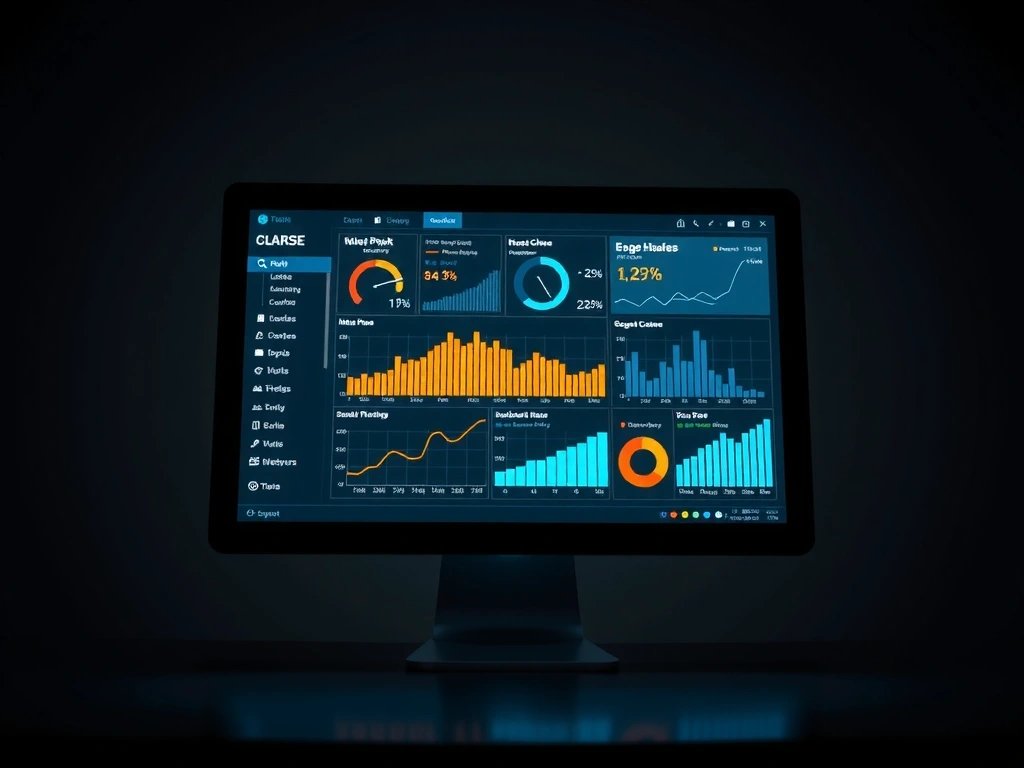
System Preview V4.2
Aesthetics Meets Technical Integrity
Our dashboard layouts adhere to the techno-style philosophy: high visual density without cognitive overload. We utilize a split-surface card system to separate operational metrics from long-term analytics trends, ensuring your team identifies critical shifts within seconds.
Omni-Channel Command
Real-time telemetry and infrastructure status monitoring.
Predictive Metrics Framework
Our analytics engine doesn't just show what happened. It models what's coming using historical lag-time data.
- Variance Detection
- Historical Baseline
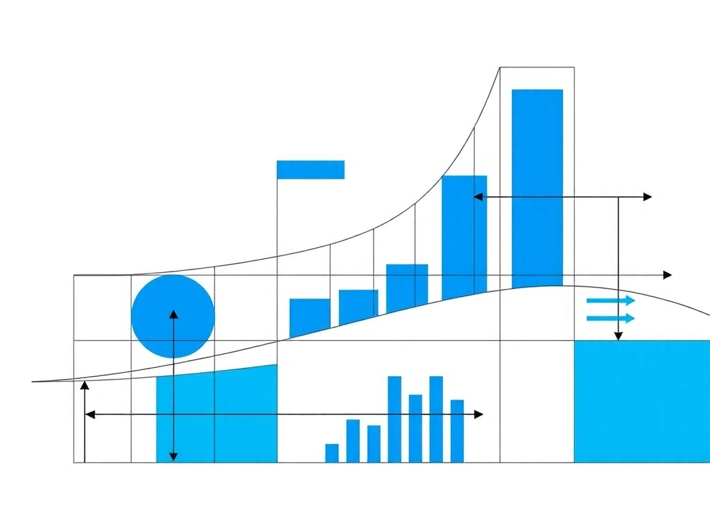
Static Clarity vs. Dynamic Noise
The High-Density Approach
Conventional dashboards try to hide data to look "clean." At Qatar Metric Structure, we believe complexity is an asset if managed correctly. Our techno-style layouts use micro-grids and typographic hierarchy to keep 40+ points of data readable on a single viewport.
Zero-Lag Perception
We design for the "executive glance." By positioning KPIs in consistent spatial anchors, our dashboard display allows decision-makers to build muscle memory for where critical metrics live, reducing mental friction during high-stress reporting periods.
Resource Repository
Whether you are optimizing an existing metrics suite or building from ground zero on Diplomatic Street, use these curated starting points to define your visual requirements.
Define Taxonomy
Classify KPIs by frequency (Daily/Weekly/Monthly) and technical reporting impact.
Select Architecture
Choose between focused executive views or detailed technical dashboard stacks.
Where to start: The Audit
New to techno-style analytics? We recommend the **Qatar Metric Structure Initial Audit**. This static assessment analyzes your current dashboard's data-to-pixel ratio and identifies where clarity is being lost in the noise.
- Scalability Check
- Latency Assessment
The Engineering Behind the Interface
A high-performing metrics dashboard is more than a collection of widgets. In the Qatar Metric Structure studio, we approach every pixel through the lens of engineering. Our dashboards utilize distinct **Z-axis layers**—meaning the the most critical, immediate data exists on a visual plane that strikes the eye first. Secondary data is categorized into "split-surface cards" that provide context without distracting from the primary mission.

Localized Context
Operating from Diplomatic Street 15, we understand the specific reporting needs of companies in Doha. Whether it's Sunday-Thursday operational cycles or region-specific fiscal tracking, our analytics configurations are built for the local reality.
By utilizing advanced Tailwind-driven design, our web-based dashboard displays are lightning fast and responsive across all devices. We avoid heavy animations that bog down technical reporting, focusing instead on instant transitions and high-contrast visuals that stay readable even in high-glare environments common in Doha's modern offices.
Ready to architect your data?
Let's discuss how your metrics can become your most powerful asset. Modern analytics starts with a conversation.